Micromodal
Micromodal.js
簡単にモーダルウィンドウを実装できるライブラリ。
CSSのデザインは標準でははいっていないので追加する。
デザインされた雛形を使う
- 軽量
- jQuery未使用
- 背景スクロールを固定
- 閉じるボタン、背景クリック、ESCボタン押下で閉じる事が可能 micromodal.vercel.app
install
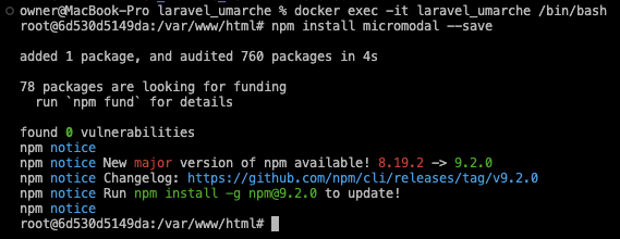
インストールできたらpackage.jsonに追加される。

import
app.cssでインポート
@import 'micromodal';
@tailwind base;
@tailwind components;
@tailwind utilities;
下記フォルダに記載。
initメソッドの中にオプションを書く。
今回はdisableScrollを設定
これにより、モーダルが開いている間はページのスクロールが無効になります。デフォルト値はfalse
import MicroModal from 'micromodal';  // es6 module

MicroModal.init({
  disableScroll: true
});
書き方↓


スタイリング
CSSの雛形↓をコピーしてresource/css/micromodal.cssファイルを作り、貼り付ける。
→npm run dev実行しコンパイルする。
View
product新規作成時、画像を4枚選択できるようにする
コンポーネントを作成し、雛形のHTMLを貼り付け。
buttonはそのままだとsubmitになってpost通信してしまうのでtype="button"を追加
モーダルを表示するためのボタンを追加
<a data-micromodal-trigger="modal-1" href='javascript:;'>Open Modal Dialog</a>
<x-select-image name="image1" />
<div class="modal micromodal-slide" id="modal-1" aria-hidden="true">
  <div class="modal__overlay" tabindex="-1" data-micromodal-close>
    <div class="modal__container" role="dialog" aria-modal="true" aria-labelledby="modal-1-title">
      <header class="modal__header">
        <h2 class="modal__title" id="modal-1-title">
          Micromodal
        </h2>
        <button type="button" class="modal__close" aria-label="Close modal" data-micromodal-close></button>
      </header>
      <main class="modal__content" id="modal-1-content">
        <p>
          Try hitting the <code>tab</code> key and notice how the focus stays within the modal itself. Also, <code>esc</code> to close modal.
        </p>
      </main>
      <footer class="modal__footer">
        {{-- `button`はそのままだとsubmitになってpost通信してしまうので`type="button"`を追加 --}}
        <button type="button" class="modal__btn modal__btn-primary">Continue</button>
        <button type="button" class="modal__btn" data-micromodal-close aria-label="Close this dialog window">Close</button>
      </footer>
    </div>
  </div>
</div>
{{-- モーダルを表示するためのボタンを追加 --}}
<a data-micromodal-trigger="modal-1" href='javascript:;'>Open Modal Dialog</a>
